Oct, 2020 - May, 2021
UX Design
UI Design
Bank Insurance Portal
* Based on confidentiality terms, all project information/data has been changed. All unauthorized copying is strictly prohibited.

Oct, 2020 - May, 2021
UX Design
UI Design
* Based on confidentiality terms, all project information/data has been changed. All unauthorized copying is strictly prohibited.
MB Bank is one of the pioneer banks in Vietnam in insurance digital transformation. Their desire is to develop an insurance information portal as well as a place to sell insurance packages.
The advantage of working for large organizations is that you will have a large team and only need to specialize on one part of the job. In this project, my main job is to design user experience, ensuring full and optimal display of information and components. Our team includes UX researcher, market researcher, business analyst and project manager and as usual, I'll start by getting to know everyone.
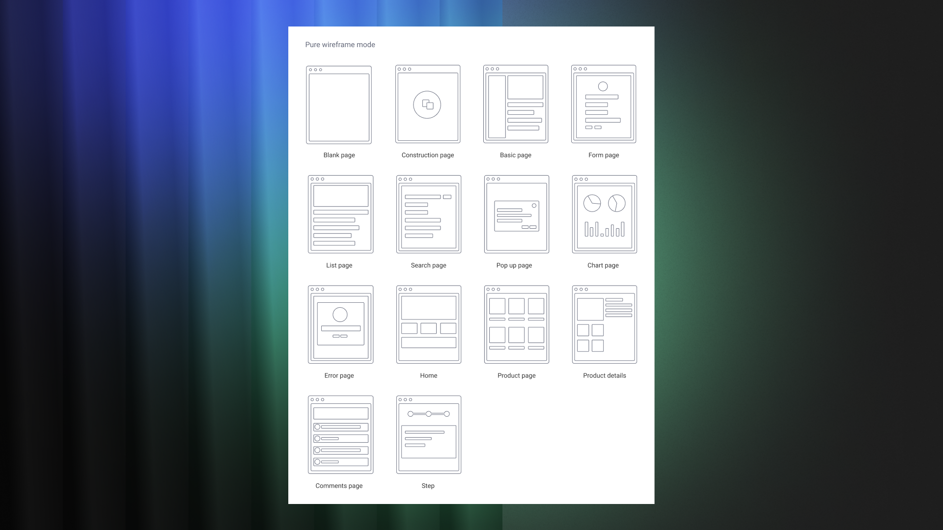
I start doing my job by receiving information about painpoints, wants & needs, user personas, etc from my co-workers and starting building wireframe. One of the challenges of the project was that there was too much information that needed to be prioritized, especially insurance terms & costs.
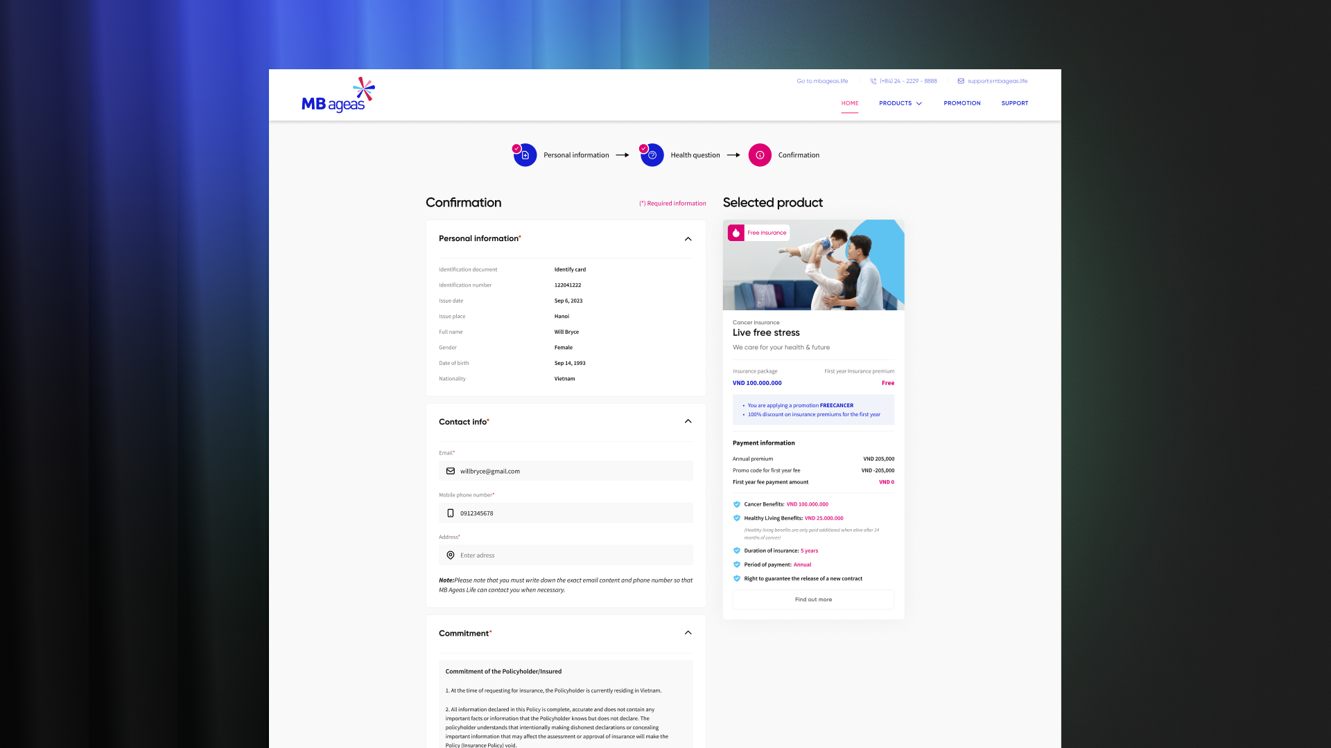
In the purchase section, I will divide the layout into 2 columns, one side is interactive, the other side is static.
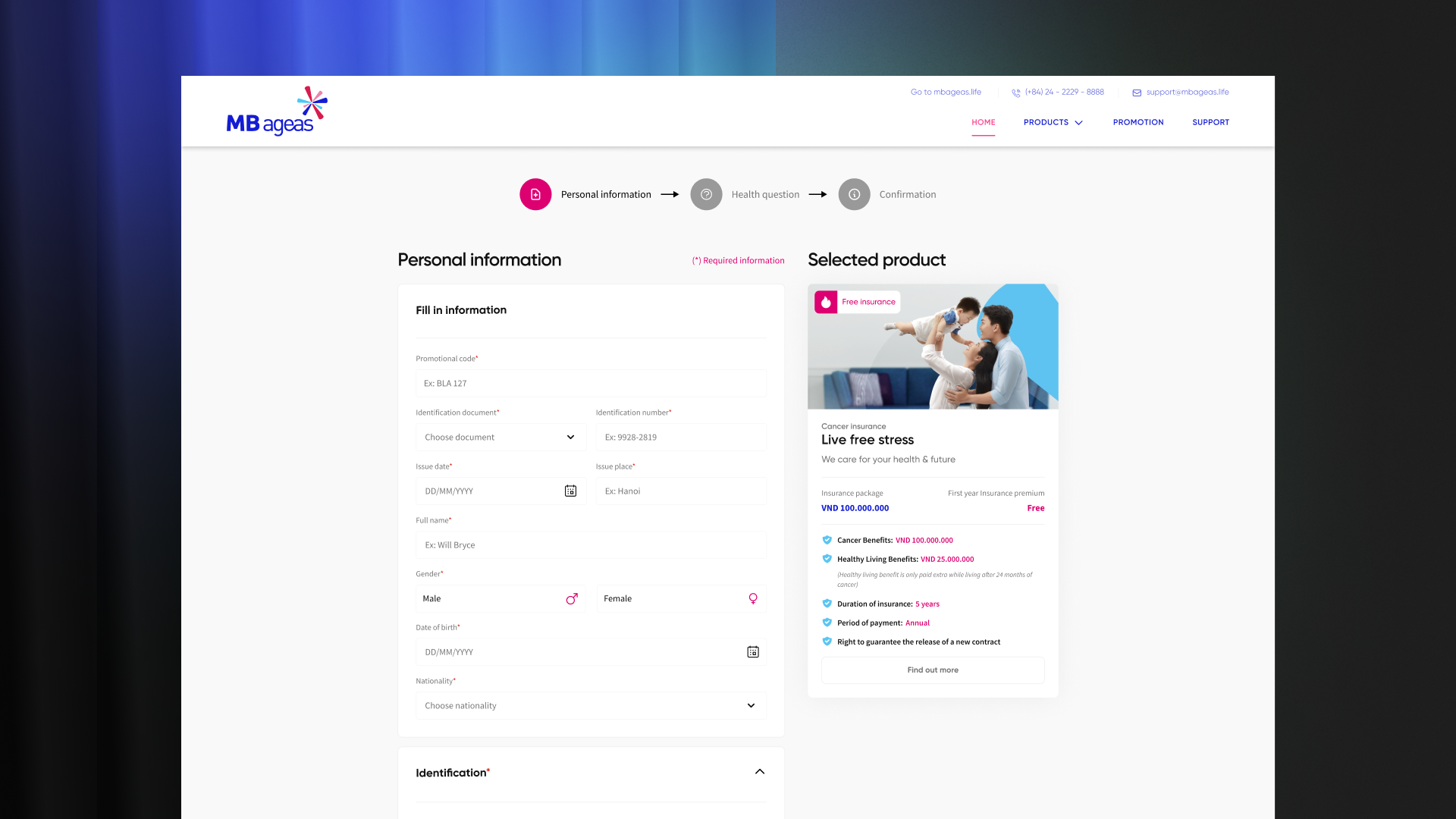
This layout helps users easily see the information about the insurance package they receive in accordance with the information they enter.
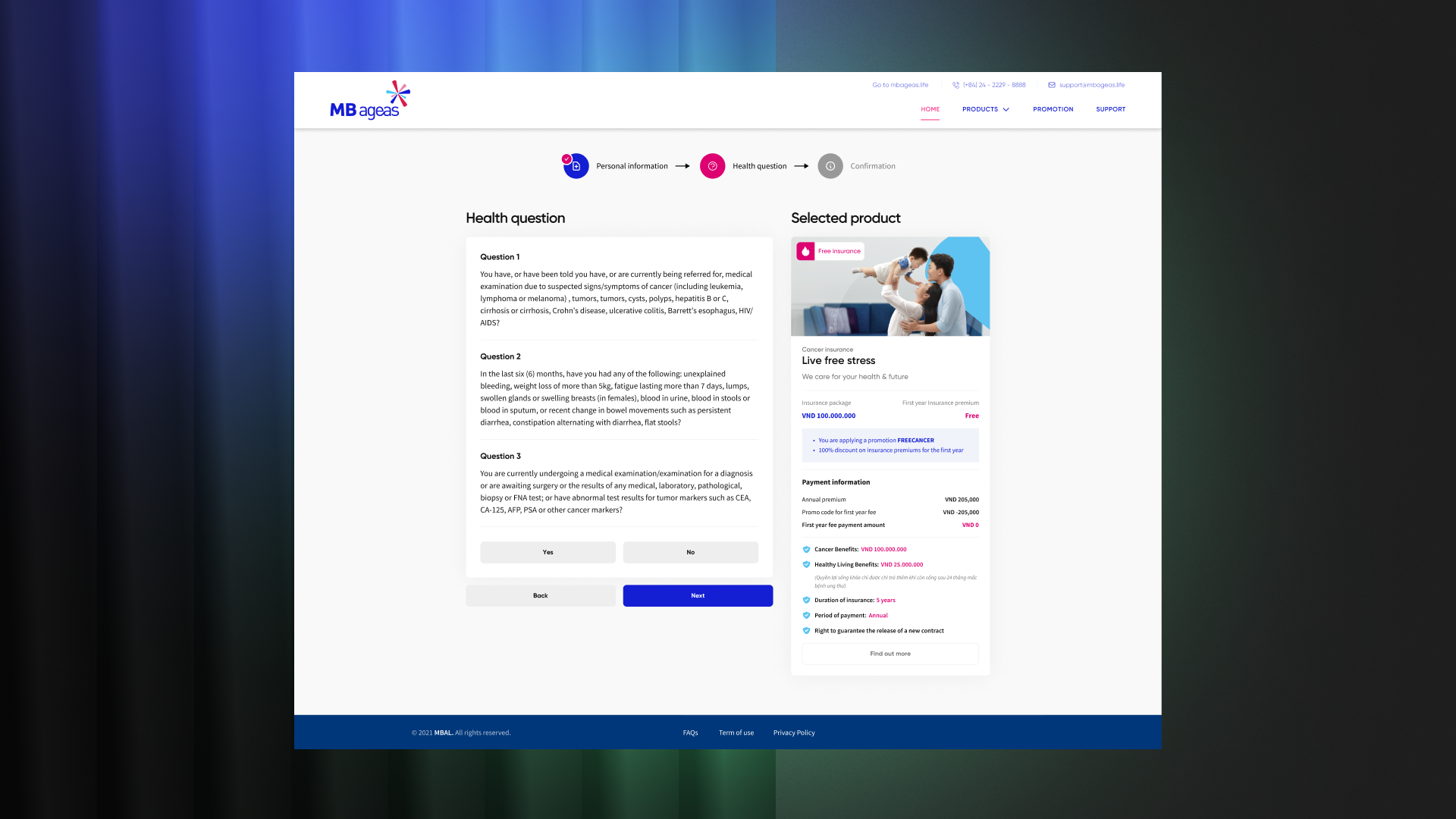
In addition, creating a strong contrast for the price is very necessary. We do not want any complaints after they pay, especially for older people whose eyesight is no longer good.
On the home page, the top priority is to highlight the 2 product packages, but if no information is provided, it is a mistake. In a study I participated in, more than 80% of users responded that they would leave if you only focused on selling products and forgot to provide benefits.

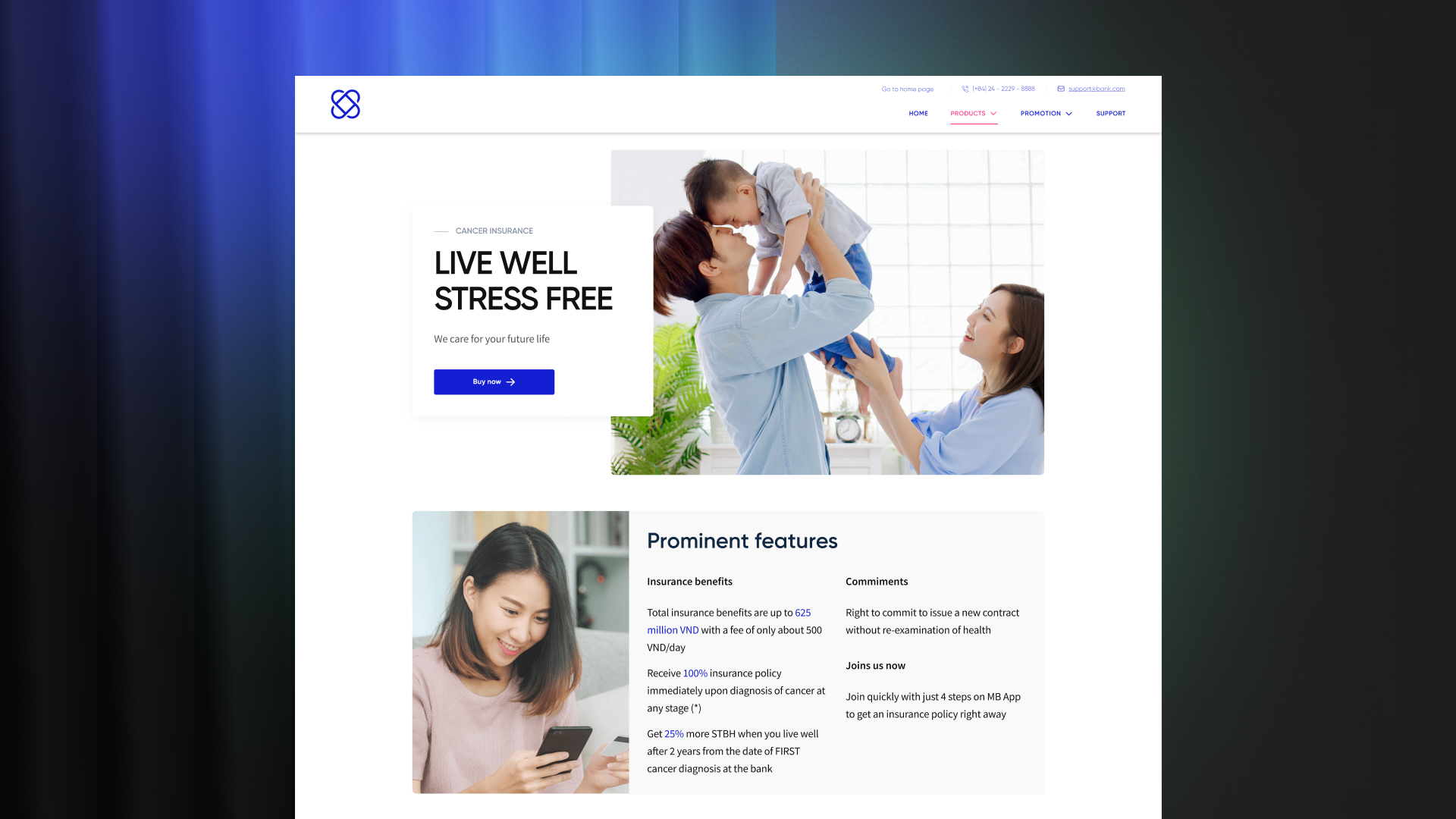
In the product section, in addition to information about product packages and offers, I want to use images and emphasize a sense of peace.
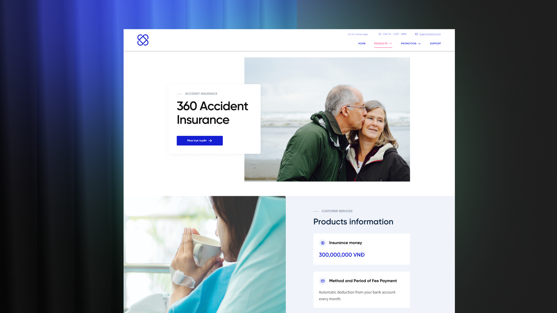
With the Z-shaped layout, interspersing text information will be more effective, as they simultaneously receive information and feel peace while learning about the product.
Let's talk:
©2023, designed & developed by ducihua